Design tips for PowerPoint
8. Move beyond bullet points
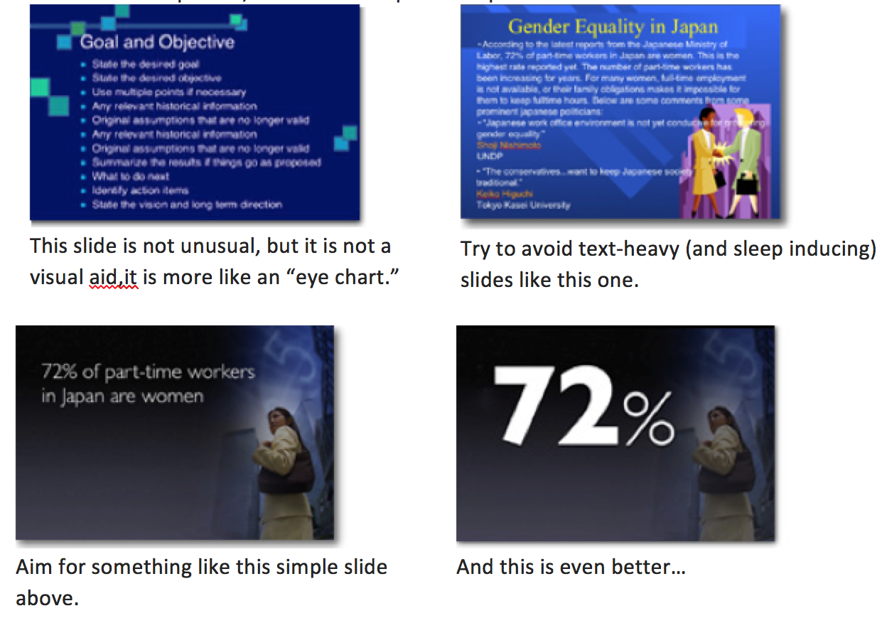
Take advantage of the medium and look for ways to convert data to visual information. Would a picture, graph or chart convey information more effectively than text?
Your presentation is for the benefit of the audience. But boring an audience with bullet point after bullet point is of little benefit to them. Which brings us to the issue of text. The best slides may have no text at all. This may sound insane given the dependency of text slides today, but the best PowerPoint slides will be virtually meaningless with out the narration (that is you). Remember, the slides are meant to support the narration of the speaker, not make the speaker superfluous.
