Design tips for PowerPoint
| Site: | Technology-Enabled Learning Lounge |
| Course: | Facilitating using PowerPoint |
| Book: | Design tips for PowerPoint |
| Printed by: | Guest user |
| Date: | Friday, 26 June 2026, 7:38 AM |
Description
Design tips for PowerPoint
Below you find some information taken from the web. Read it critically asking yourself whether or not it is a good tip in YOUR learn environment and with YOUR learners.
From: https://student.unsw.edu.au/design-tips
Make it clear
- Visuals should be concise, simple and relevant.
- Arrange your visuals in a logical sequence in line with your presentation structure.
- Each visual should convey a specific idea, point, or topic area. Use one message per slide.
- Limit the amount of text on each slide. Don’t reproduce your entire presentation script, just main points and key words. Edit out words you don't need until each statement is as concise as possible.
- Check spelling and grammar.
- Limit the number of slides to 5 or 6 per 10 minutes.
Make it big
- Visuals should be readable from the back of the room.
- Use a large font (at least 24 points).
- Avoid overly elaborate typefaces. Choose a simple font, like Helvetica, Arial or Times.
- Don’t use all capitals. Blocks of text are hard to read.
- Make sure captions on pictures or graphs can be clearly seen from the back of the room.
Keep it simple - Don’t overdesign
- Your slides should be simple and clear. Eliminate unnecessary information and clutter.
- Make use of white space and don’t cram too much on each slide. For each addition, ask yourself ‘is this necessary; what does it add to the message?’
- Avoid busy backgrounds that make text hard to read.
Keep it simple - Don't go overboard with technology
- Aim to communicate, not to win an Oscar for special effects.
- Use animations sparingly. Effects like flying or flashing text can distract your audience. What value do they really add to your talk or your topic?
- Only include elements like sound and video if they are the best way to convey particular information.
- The sound effects that accompany PowerPoint animations are best avoided altogether.
Be consistent
- Choose a general 'look' for your presentation and stick to it. Maintain a unity of key design elements from slide to slide.
- Don't get carried away with fonts, colours, styles etc. Use the same themes (colours, backgrounds, fonts etc) throughout your slideshow.
- Visual consistency can link your slides and help your presentation to flow.
Be visual
- The impact of visuals is greatly increased by colour IF it is used well.
- Ensure there is a clear contrast between text and background colour.
- Use a highlight colour to emphasis key words.
- Don’t use too many colours on one slide.
- Use colours that harmonise rather than clash. Bright shades can look harsh when projected.
- If you’re not sure how to put colours together, make use of the colour schemes available in PowerPoint.
Move beyond bullet points
- Take advantage of the medium and look for ways to convert data to visual information. Would a picture, graph or chart convey information more effectively than text?
Use graphics well
- Choose graphic material to support your presentation. Don’t include graphics purely for decoration.
- Use 1-2 images per slide.
- Pictures should be clear and in focus.
- Tables or graphs should be simple and readable from the back of the room.
- Remember that what may look clear and focussed on your computer screen will probably be paler and less focussed when projected onto a large screen.
Table of contents
- 1. Make it Clear
- 2. Keep it Simple
- 3. Make it big
- 4. Be Consistent
- 5. Use colour well
- 6. Choose your fonts well
- 7. Be Visual
- 8. Move beyond bullet points
- 9. Use Graphics Well
- 10. Use appropriate charts
- 11. Use video and audio when appropriate
- 12. Spend time in the slide sorter
- 13. 20 Quick Tips
- 14. Further Reading
1. Make it Clear
- Visuals should be concise, simple and relevant.
- Arrange your visuals in a logical sequence in line with your presentation structure.
- Each visual should convey a specific idea, point, or topic area. Use one message per slide.
- Limit the amount of text on each slide. Don’t reproduce your entire presentation script, just main points and key words. Edit out words you don't need until each statement is as concise as possible.
- Check spelling and grammar.
- Limit the number of slides to 5 or 6 per 10 minutes.
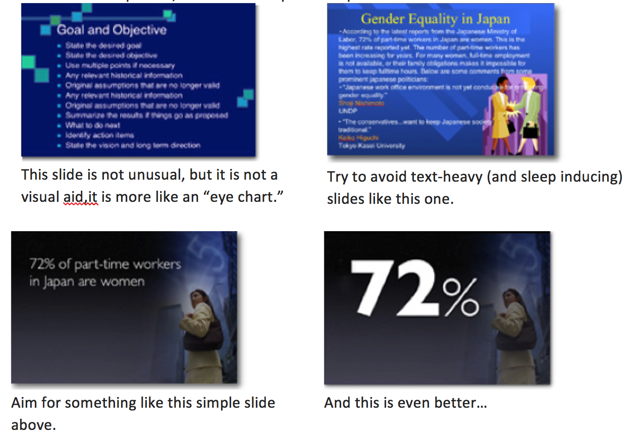
2. Keep it Simple
Nothing in your slide should be superfluous, ever.
Your slides should have plenty of “white space” or “negative space.” Do not feel compelled to fill empty areas on your slide with your logo or other unnecessary graphics or text boxes that do not contribute to better understanding. The less clutter you have on your slide, the more powerful your visual message will become.
Don’t overdesign
- Your slides should be simple and clear. Eliminate unnecessary information and clutter.
- Make use of white space and don’t cram too much on each slide. For each addition, ask yourself ‘is this necessary; what does it add to the message?’
- Avoid busy backgrounds that make text hard to read.
Don't go overboard with technology
- Aim to communicate, not to win an Oscar for special effects.
- Use animations sparingly. Effects like flying or flashing text can distract your audience. What value do they really add to your talk or your topic?
- Only include elements like sound and video if they are the best way to convey particular information.
- The sound effects that accompany PowerPoint animations are best avoided altogether.
3. Make it big
Make it big
- Visuals should be readable from the back of the room.
- Use a large font (at least 24 points).
- Avoid overly elaborate typefaces. Choose a simple font, like Helvetica, Arial or Times.
- Don’t use all capitals. Blocks of text are hard to read.
- Make sure captions on pictures or graphs can be clearly seen from the back of the room.
4. Be Consistent
- Choose a general 'look' for your presentation and stick to it. Maintain a unity of key design elements from slide to slide.
- Don't get carried away with fonts, colours, styles etc. Use the same themes (colours, backgrounds, fonts etc) throughout your slideshow.
- Visual consistency can link your slides and help your presentation to flow.
5. Use colour well
Colour evokes feelings. Colour is emotional. The right colour can help persuade and motivate. Studies show that colour usage can increase interest and improve learning comprehension and retention.
You do not need to be an expert in colour theory, but it’s good for business professionals to know at least a bit on. Colours can be divided into two general categories: Cool (such as blue and green) and Warm (such as orange and red). Cool colours work best for backgrounds as they appear to recede away from us into the background. Warm colours generally work best for objects in the foreground (such as text) because they appear to be coming at us. It is no surprise, then, that the most universal PowerPoint slide colour scheme includes a blue background with yellow text. You do not need to feel compelled to use this colour scheme, though you may choose to use a variation of those colours.
6. Choose your fonts well
Fonts communicate subtle messages in and of themselves, which is why you should choose fonts deliberately. Use the same font set throughout your entire slide presentation, and use no more than two complementary fonts (e.g., Arial and Arial Bold). Make sure you know the difference between a Serif font (e.g., Times New Roman) and a Sans-Serif font (Helvetica or Arial). Serif fonts were designed to be used in documents filled with lots of text. Serif fonts are said to be easier to read at small point sizes, but for on screen presentations the serifs tend to get lost due to the relatively low resolution of projectors. San-serif fonts are generally best for PowerPoint presentations. Regardless of what font you choose, make sure the text can be read from the back of the room.
7. Be Visual
- The impact of visuals is greatly increased by colour IF it is used well.
- Ensure there is a clear contrast between text and background colour.
- Use a highlight colour to emphasis key words.
- Don’t use too many colours on one slide.
- Use colours that harmonise rather than clash. Bright shades can look harsh when projected.
- If you’re not sure how to put colours together, make use of the colour schemes available in PowerPoint.
8. Move beyond bullet points
Take advantage of the medium and look for ways to convert data to visual information. Would a picture, graph or chart convey information more effectively than text?
Your presentation is for the benefit of the audience. But boring an audience with bullet point after bullet point is of little benefit to them. Which brings us to the issue of text. The best slides may have no text at all. This may sound insane given the dependency of text slides today, but the best PowerPoint slides will be virtually meaningless with out the narration (that is you). Remember, the slides are meant to support the narration of the speaker, not make the speaker superfluous.
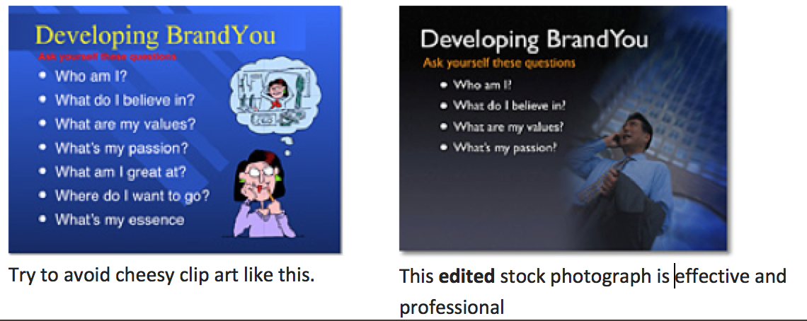
9. Use Graphics Well
Use high-quality graphics including photographs. You can take your own high-quality photographs with your digital camera, or use the overabundance of high-quality images available on line (be cautious of copyright issues, however). Never simply stretch a small, low-resolution photo to make it fit your layout – doing so will degrade the resolution even further. Avoid using PowerPoint Clip Art or other cartoonish line art as your audience has seen it a million times before. There are exceptions, of course, and not all PowerPoint art is dreadful, but use carefully and judiciously.
- Choose graphic material to support your presentation. Don’t include graphics purely for decoration.
- Use 1-2 images per slide.
- Pictures should be clear and in focus.
- Tables or graphs should be simple and readable from the back of the room.
- Remember that what may look clear and focussed on your computer screen will probably be paler and less focussed when projected onto a large screen.
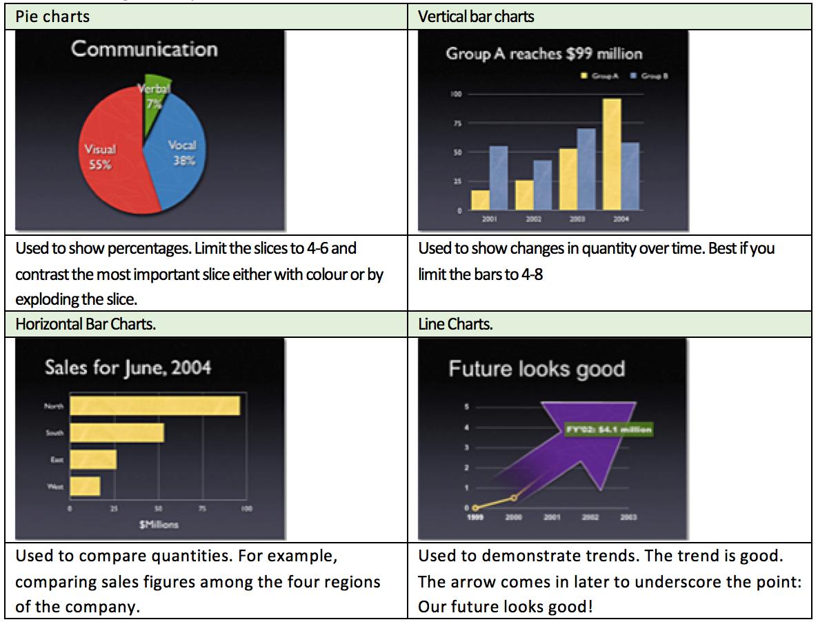
10. Use appropriate charts
Always be asking yourself, “How much detail do I need?” Presenters are usually guilty of including too much data in their on-screen charts. There are several ways to display your data in graphic form; here are a few things to keep in mind:
11. Use video and audio when appropriate
Use video and audio when appropriate. Using video clips to show concrete examples promotes active cognitive processing, which is the natural way people learn. You can use video clips within PowerPoint without ever leaving the application or tuning on a VCR. Using a video clip not only will illustrate your point better, it will also serve as a change of pace thereby increasing the interest of your audience. You can use audio clips (such as interviews) as well. Something to avoid, however, is cheesy sound effects that are included in PowerPoint (such as the sound of a horn or applause when transitioning slides). The use of superfluous sound effects attached to animations is a sure way to lose credibility with your audience.
12. Spend time in the slide sorter
People comprehend better when information is presented in small chunks or segments. By getting out of the Slide View and into the Slide Sorter view, you can see how the logical flow of your presentation is progressing. In this view you may decide to break up one slide into, say, two-three slides so that your presentation has a more natural and logical flow or process. In this view you will be able to capture more of the gestalt of your entire presentation from the point of view of your audience. You will be able to notice more extraneous pieces of visual data that can be removed to increase visual clarity and improve communication.
13. 20 Quick Tips
Here is a list of tips from http://cubicleninjas.com/top-20-best-powerpoint-presentation-design/
- Uses a minimal method
- High quality images
- No more than 6 words per slide
- Large type font
- Bold colour
- Strong images
- Personal photographs trigger emotion
- 1 key point per slide
- relatable symbols and pictographs
- Minimal slide use
- Consistent design
- Design template correlates with the subject
- Simple and clear
- Use 10.20.30 rule [10 slides, in 20 minutes, use font size 30]
14. Further Reading
For further DESIGN TIPS try these websites:
http://www.alleywatch.com/2013/08/71-compelling-surprising-powerpoint-tips-from-the-pros/
http://tep.uoregon.edu/technology/powerpoint/docs/hottipsppt.pdf
Now it is your turn, try a web search for more tips. There is a wealth of information out there. Share the gems you find with the course participants in the Forum: Design tips for creating quality interactive PowerPoint slides for use in facilitation.